Statistics
User statistics are the goldmine of insights for any organisation. The Statistics tab is an advanced dashboard designed to reveal exactly how users interact with your Genie – from the questions they ask to the pain points they encounter.
Rather than deploying a chatbot with no visibility, myReach provides a comprehensive, AI-powered analytics suite. This data allows your Customer Success and Marketing teams to identify trends, pinpoint missing information and make data-driven decisions to optimise user engagement and increase conversions.
🗓️ Analysing Performance by Date
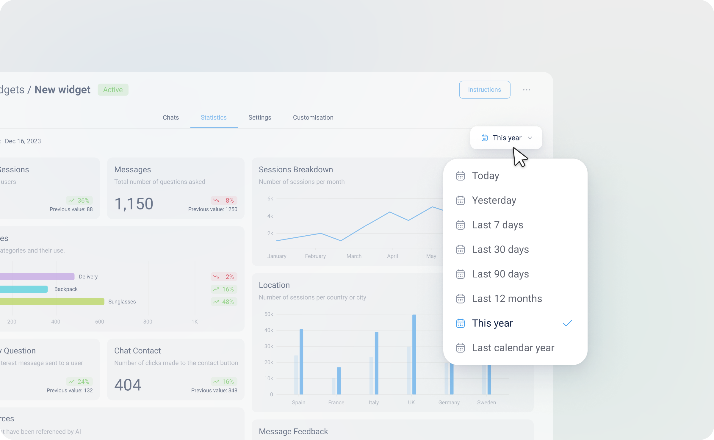
To perform deep analysis of specific periods, you can use the interactive calendar feature located in the top-right corner of the dashboard.
-
Predefined Ranges: Quickly view data from Today, Yesterday, This Week, This Month, This Year, or the Last 90 Days.
-
Custom Date Range: Select specific start and end dates (e.g., from the day of a product launch to one week after) for targeted analysis.
-
Comparative Insights: Every metric card includes a "Previous Value" indicator. The period depends on the timeframe selected. This allows you to compare the current period with the previous one (e.g., This Week vs. Last Week / Today vs. Yesterday), showing the percentage increase or decrease in performance.
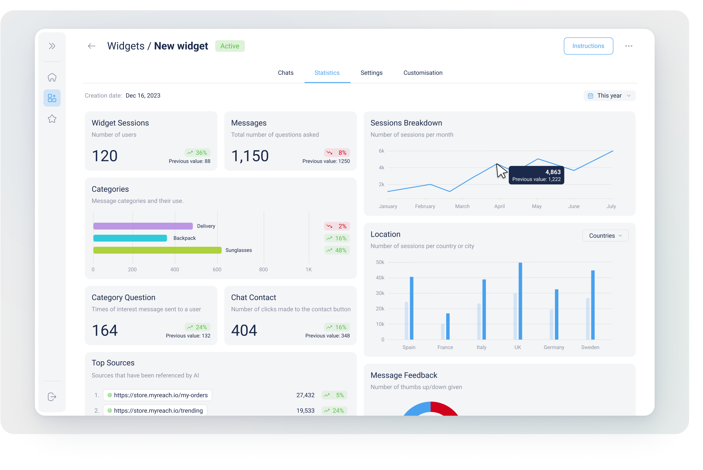
📊 Key Metrics and Analytics
Engagement Metrics
-
Genie Sessions: The total number of unique users interacting with your AI. Each session is counted as 1 user.
-
Messages: Total volume of queries processed (messages sent to the Genie).
-
Average Messages/Chat: The average number of messages per chat session. This measures the depth of user interactions.
-
Messages Breakdown: The number of daily or monthly messages (depending on the selected timeframe) in a line chart format, allowing you to track trends over time.
-
Chat Contact & Speak to an Agent: Tracks how often users click your contact button or request human intervention (ie. to speak to a human agent).
Content & AI Performance
-
Resolution Rate: Measures the percentage of chats successfully resolved based on user feedback when they close the chat.
-
Message Feedback: The number of thumbs-up / thumbs-down ratings given by users, displayed in a pie chart format.
-
Unable to Answer: Highlights questions the AI could not resolve – a key indicator of missing information in your Knowledge Base.
-
Sources Referenced & Clicked: Identifies and lists which documents and links in your Knowledge Base are most valuable to your users.
-
Top Genie Pages: Tracks which pages of your website see the highest level of Genie interaction.
AI Classification (Categories)
This section visualises the custom Categories you have created. It reveals the "What" and the "Why" behind user behaviour:
-
Categories: Displays message Categories and their usage in a bar chart format (e.g. Shipping vs. Technical Support). Click here to find out more about Categories.
-
Message Categories and Types: Two pie charts:
-
One for message Categories (customised by you based on the Categories you've created in AI < Categories).
-
The other for the message types (automatically detected, if there is a. no info available, b. user asks to speak to an agent, c. everything else)
-
These two statistics are visually represented in a pie chart format, providing a quick visual summary.
- Location: The number of sessions per country or city in a bar chart format.
🧪 Qualitative vs. Quantitative Analysis
While the Statistics dashboard provides powerful quantitative data (numbers and charts), it can be further enhanced by our Reports feature.
-
Statistics (Quantitative): Focuses on how many sessions, how many clicks and which Categories are active.
-
Reports (Qualitative): Provides a deeper analysis of the nature of the conversations, synthesising user sentiment and providing narrative summaries of user pain points. Click here to find out more about Reports.
🚀 Practical Use Cases
-
Gap Identification: Use the "Unable to Answer" metric to find out what's missing on your website or in your manuals.
-
Marketing Funnels: Identify high-interest Categories and create targeted email campaigns based on those specific needs.
-
Geographic Strategy: Use the Location bar chart to see where your users are coming from and tailor your content or support language accordingly.
-
Trend Analysis: Use the line and bar charts to identify trends over time, such as increased or decreased interest in specific Categories or monthly sessions vs. conversion rates.
-
Feedback Review: Check the Message Feedback pie chart to measure user satisfaction and areas for improvement.
In addition, with Reports there is one added Use Case: - Comparative Reports: Get detailed reports with weekly quantitative and qualitative comparisons.
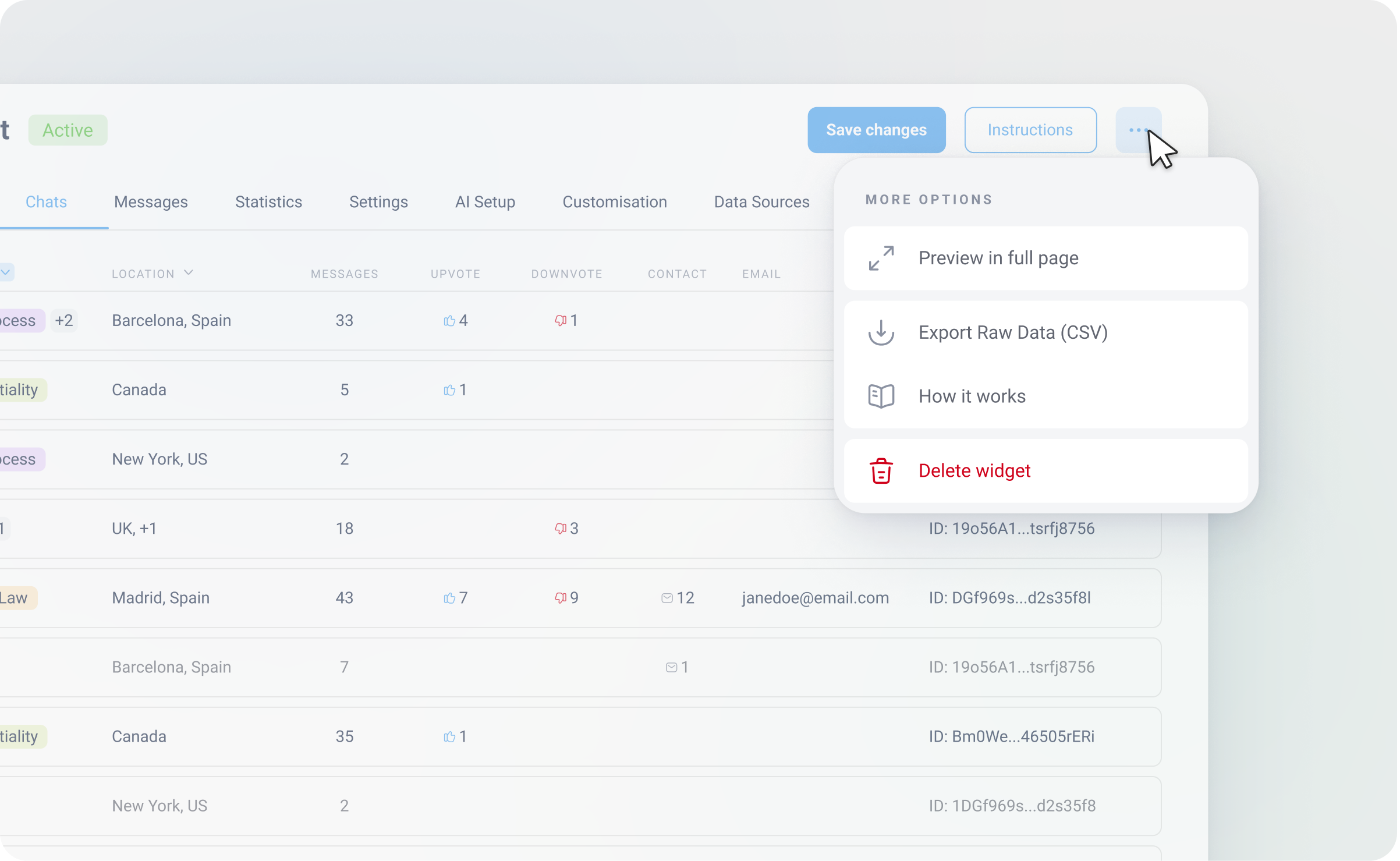
Export the statistics
If you prefer conducting your own analysis, you can export the raw data as a CSV and analyse it your own way.
Click on the three dots in the top right of the screen (next to instructions) and select Export Raw Data (CSV). Once your data has been processed you will receive an email with a link to download it.