3D Visualiser
The 3D Visualiser is a powerful layout that provides a unique and three-dimensional perspective on how all your information is interconnected.
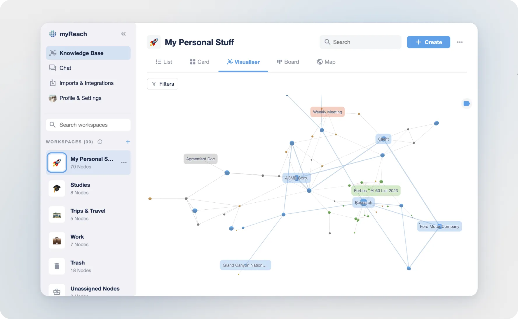
Here's a breakdown of how it works:
Interactive Navigation: you can rotate and spin the view to explore your interconnected data fully.
In the Mobile App:
-
Swipe with ONE finger to rotate around the visualiser
-
Swipe with TWO fingers to pan vertically or horizontally
-
Pinch with two fingers to zoom in and out
In the Web App:
-
Click + Swipe with ONE finger to rotate around the visualiser
-
Click + Swipe with TWO fingers to pan vertically or horizontally
-
Swipe up or down with two fingers to zoom in and out
To centre the visualiser, click on the three buttons option and then “Center Visualiser” in the workspace options.
Custom Labels: To avoid clutter, you can click on the top right corner label icon to toggle labels on or off.
-
Green nodes = websites
-
Blue nodes = tags
-
Orange nodes = notes
-
Gray nodes = documents
Relationships: Relationships between items are visually represented and colour-coded based on the type of node:
-
Blue: relationships between two TAGS
-
Gray: relationships between other NODES (websites, files, notes)
-
Red / Purple: mentions-based relationships
Item Filtering: Clicking on an item in the Visualiser filters the view to display only the connected nodes and information related to that item. This declutters the view and allows for a focused exploration.
To deselect a filtered view, double-click anywhere on the visualiser.