Card View
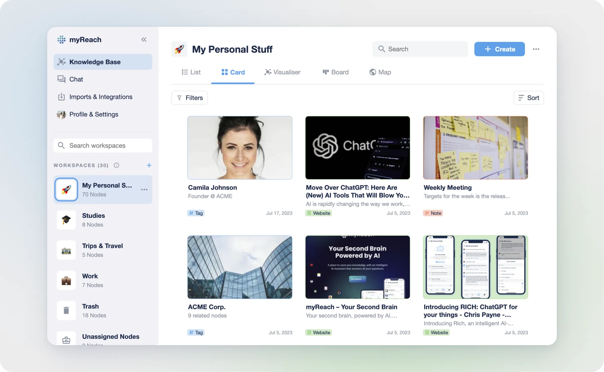
Card View displays nodes as interactive cards, offering a visually appealing and organised way to view your data.
Each node is represented as a card, making it easier to recognise and interact with your items. By default, each item displays a thumbnail preview, as well as key information about the item: title, node type, creation date, etc.
Right Click functionality in the web: You can right-click on cards to see more options including:
-
"Add search filters": adds the item as a filter for your search. Only nodes directly related to the selected item will be displayed.
-
“Exclude from search”: searches for everything except things related to that item
-
“Select”: to select multiple items at the same time and do actions in bulk (send to trash, connect to another node, assign to another workspace, add a property, etc).
-
"Open Website" (Only for website nodes): to open a website in new tab.
-
"Preview" (Only for file nodes): Opens the preview of a file.
-
"Send to trash": to trash a node
-
This can also be done by hovering over an item and clicking the select option in the top right of the card.
The “Select” function can also be used in the Mobile App by hold-clicking an item.